Responsive React table — mobile card layout
▶ See it before you install: the live mobile demo — the same table flipped between desktop rows and phone cards with one toggle.
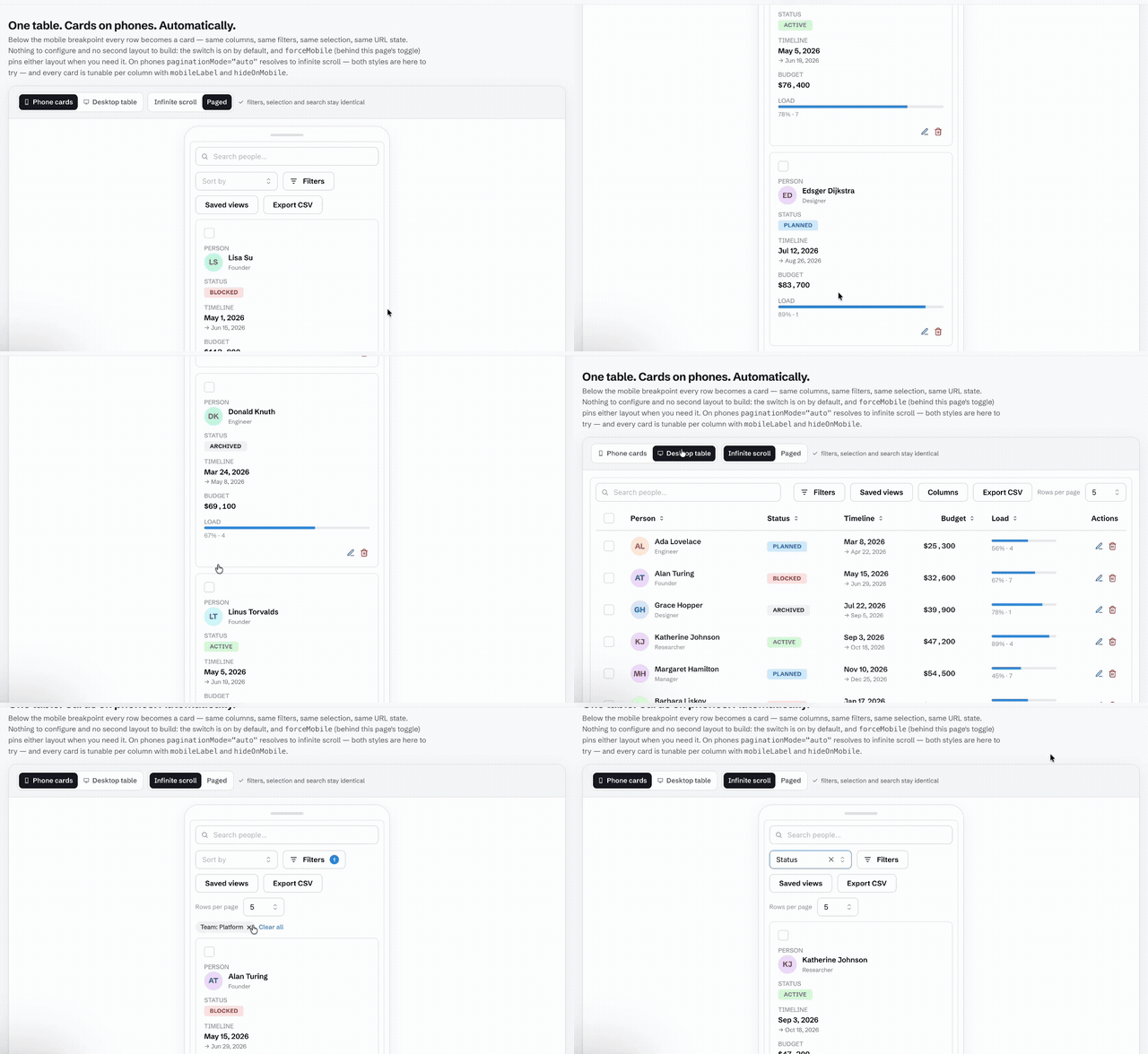
Most React data tables answer the phone problem with a horizontal scrollbar.
AdaptTable answers it with a different layout: below the mobile breakpoint,
every row renders as a card — same columns, same filters, same search,
same selection, same URL state — and the switch happens by itself. There is
no second component to build, no isMobile plumbing, and nothing to
configure to get the default behavior.
<DataTable data={rows} columns={columns} rowKey={(r) => r.id} />That is already responsive. On a desktop viewport it renders the full table; on a phone it renders the card list. Everything below is tuning.
What changes on mobile — and what deliberately doesn’t
Section titled “What changes on mobile — and what deliberately doesn’t”| Surface | Desktop | Mobile |
|---|---|---|
| Rows | <table> rows |
Cards — one per row, labels from the column headers |
| Sorting | Clickable column headers | A sort-by <select> (options via sortByOptions) |
| Pagination | Pager (or infinite) | paginationMode="auto" resolves to infinite scroll |
| Row actions | Trailing icon buttons | Card buttons |
| Long lists | Row virtualization (virtualize) |
Card virtualization through the same prop |
| Filters, chips, search, selection, bulk bar, saved views, URL state | identical | identical |
The second half of that table is the point: behavior that took real work to get right — declarative filters, select-across-pages, shareable URL state — does not fork into a second code path on phones. One table, one state, two layouts.
Tuning the cards
Section titled “Tuning the cards”mobileLabel(per column) — the label a card shows for that field; falls back to the column’s stringheader, then to its key. Set it to""for a field with no label at all — a bare avatar or title line — rather than an empty caption taking a line.resolveMobileLabelfrom@adapttable/core/adapteris the resolver every adapter uses, for a custom card layout that should match.hideOnMobile(per column) — drop a column from cards entirely.mobileIdentityColumns(default3) — how many leading desktop-visible columns the cards always keep.sortByOptions— the options offered by the mobile sort-by select.forceMobile— pin either layout regardless of viewport: cards inside a desktop dashboard panel, or the full table in a tablet kiosk. The mobile demo uses exactly this prop for its toggle.rowClassNameapplies to desktop rows and mobile cards alike, and the class-hook /data-adapttable-partsurface names the card regions (cardDetail,group-card,summaryCard) for styling.rowStyle/rowHeightapply the same way — see row styling and heights.
Your own card
Section titled “Your own card”The built-in card is a stack of labelled fields, which is right for most tables and wrong for some: an order wants its total large and its reference small; a person wants their avatar beside their name rather than under a caption reading “Avatar”.
renderCard replaces that stack — and only that stack:
<DataTable data={people} columns={columns} rowKey={(r) => r.id} renderCard={(row, card) => ( <article className="person-card"> <img src={row.avatarUrl} alt="" /> <h3>{row.name}</h3> <dl> {card.fields.map(({ column, label, value }) => ( <div key={column.key}> {label && <dt>{label}</dt>} <dd>{value}</dd> </div> ))} </dl> </article> )}/>The card’s shell stays around what you return: the list-item semantics, the selection checkbox, the expand and tree toggles, the reorder controls, the row actions and the detail panel. A custom card cannot drop the parts that make the list usable, because it never owns them.
card.fields is what the built-in would have laid out — each field’s
column, its resolved label (undefined when the column asked for none)
and its value, rendered exactly as the built-in renders it, cell renderers
and editors included. So this is a layout decision, not a re-implementation:
reuse the values and arrange them your way. card.selected, card.expanded
and card.index come along for cards that change with their state.
Omit it and the built-in card renders, byte for byte.
Where the switch happens
Section titled “Where the switch happens”mobileBreakpoint is the width, in pixels, at or below which the cards take
over. It defaults to 768 — a phone in portrait.
<DataTable data={rows} columns={columns} rowKey={(r) => r.id} mobileBreakpoint={1024}/>Raise it when the table lives in a sidebar or a split pane: the viewport says “desktop” while the table itself has a phone’s width to work with, and the default would keep a five-column table in a 300px column. Lower it when the table is the whole page and its columns are narrow enough to survive.
The width in between
Section titled “The width in between”Between “everything fits” and “narrow enough for cards” there is a long middle where a table has too many columns. The usual outcomes are a horizontal scrollbar nobody finds, or columns squeezed until nothing is legible — neither is a decision.
responsivePriority is the decision, made by the person who knows the data:
const columns = [ { key: "name", header: "Name", width: 200 }, { key: "team", header: "Team", width: 160, responsivePriority: 1 }, { key: "note", header: "Note", width: 240, responsivePriority: 2 },];Priority 1 is kept longest, in the ordinary sense of the word. As the table
narrows, note goes first, then team. name never goes — a column that
omits responsivePriority is never dropped, which is how the columns carrying
the row’s identity stay put by saying nothing. A table where no column sets it
behaves exactly as it did before.
The budget is arithmetic on each column’s declared width (a resize wins over
it, and a column with no width is budgeted at 150px), so it settles in one pass
and gives the same answer every time. There is no measure-drop-remeasure loop,
which is what makes tables that do it flicker.
A dropped column is a fact about the viewport, not a choice the user made: it never reaches the layout state, the URL or a saved view, and the column menu still lists it.
It composes with everything else
Section titled “It composes with everything else”- Grouping renders group header blocks between cards, with the same collapse behavior as desktop — see row grouping.
- Virtualization windows the card list the same way it windows rows:
one
virtualizeprop, measured in a real browser across every adapter — see virtualization. - RTL flips the cards along with everything else — see i18n & RTL.
- Every adapter ships it: Mantine, MUI, Chakra, Ant Design, Radix, Base UI, shadcn/ui and unstyled all render the card layout natively — the comparison table tracks it as a built-in across the board.
When you still want the table on phones
Section titled “When you still want the table on phones”Set forceMobile={false} and the desktop layout renders everywhere —
sticky header, pinned columns and horizontal scrolling included. The cards
are the default because thumb-reach beats pinch-zoom for row-by-row work,
but the choice stays yours per table.
Related: Getting started · API reference · Live mobile demo